
Introduction
Charts are the foundation of technical analysis as they provide a visual representation of an asset’s price changes over time. Before traders can identify trends, recognize chart patterns, or analyze support and resistance levels, they first need to understand how price information is displayed.
Modern trading platforms offer several chart types, displaying the same market data in various ways. While the information remains the same, the way it is visualized can influence how easily traders identify trends, price movements, and potential trading opportunities.
In this lesson, you will learn about the three main types of trading charts, how they differ, and when traders typically use each one.
What is a trading chart?
A trading chart is a visual representation of an asset's price movement over a specific period of time. Whether analyzing forex, stocks, commodities, or cryptocurrencies, charts allow traders to review historical price action and monitor how prices are changing.
Every chart is built from the same underlying market data. The difference lies in how that information is presented.
For example, one chart may display only closing prices, while another shows the opening, highest, lowest, and closing prices for each trading period. Although the appearance changes, the underlying price data remains identical.
Understanding this distinction can help traders choose the chart type that best suits their trading style and analytical approach.
Why do traders use charts?
Price movements generate large amounts of market data that can be difficult to interpret in numerical form alone. Charts organize this information visually, making it easier to identify:
- Market trends and chart pattern
- Areas where prices have repeatedly reversed direction
- Changes in market momentum
- Potential trading opportunities
Rather than attempting to predict the future, technical traders use charts to:
- Understand how the market has behaved
- Assess what that behavior may suggest about possible future price movements
The three main types of trading charts
Although many chart variations exist, most traders use one of three chart types:
- Line charts
- Bar charts
- Candlestick charts
Each has its own advantages and is better suited to different levels of analysis of the same market data.
Line Charts
A line chart is the simplest type of trading chart.
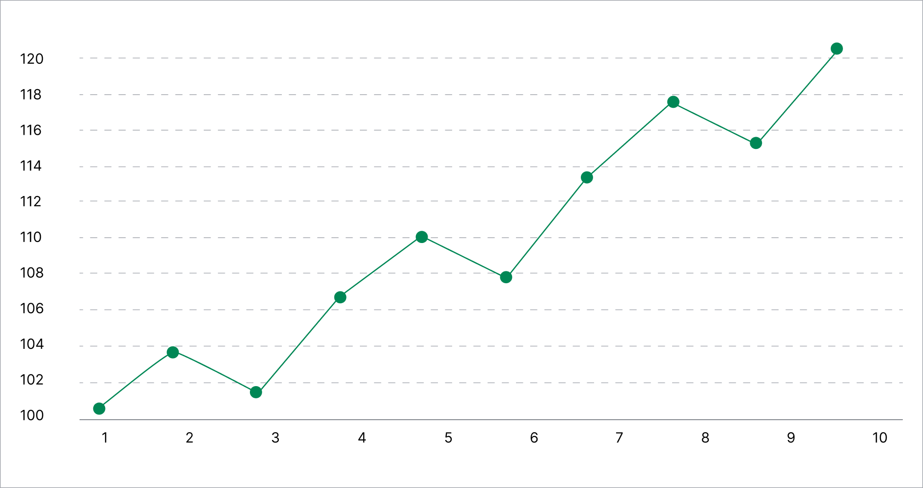
It is created by connecting the closing price of each trading period with a continuous line. Because it focuses only on closing prices, the chart provides a clean view of the overall market direction.
Many beginners find line charts easy to understand because they remove much of the short-term price fluctuation visible on more detailed charts.
However, this simplicity also means less information is available. Since line charts do not display opening prices, highs, or lows, they provide limited insight into intraday price movements.
Best suited for:
- Identifying long-term trends
- Viewing overall market direction
- Beginners learning basic chart analysis
Bar Charts
Bar charts provide more detailed price information than line charts.
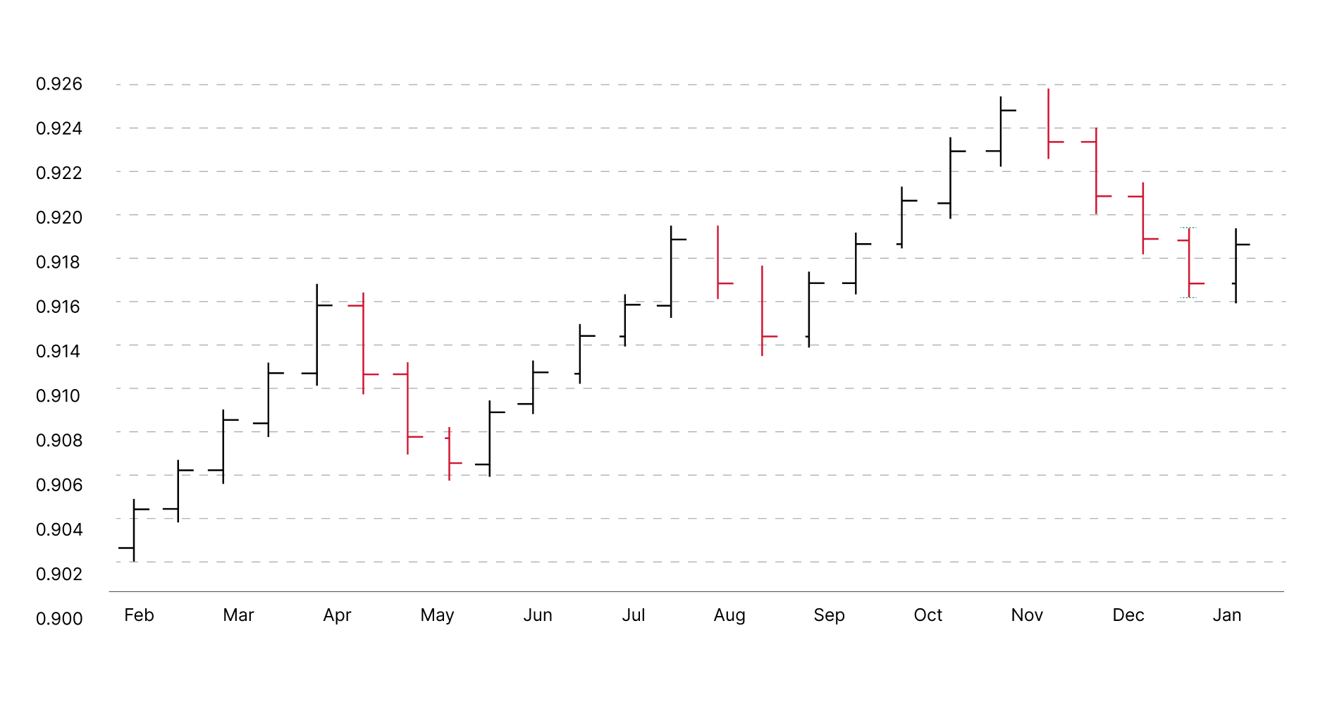
Each bar represents a single trading period and displays four prices:
- Opening price
- Highest price
- Lowest price
- Closing price
This is commonly referred to as OHLC (Open, High, Low, Close) data.
Although bar charts contain considerably more information than line charts, they can appear less intuitive to traders who are unfamiliar with reading price charts.
Because of this, bar charts are often preferred by experienced traders who want detailed price information without the visual style of candlesticks.
Best suited for:
- Analyzing detailed price movements
- Reviewing historical price behavior
- Traders comfortable interpreting OHLC data
Candlestick Charts
Candlestick charts are the most widely used chart type in financial markets today.
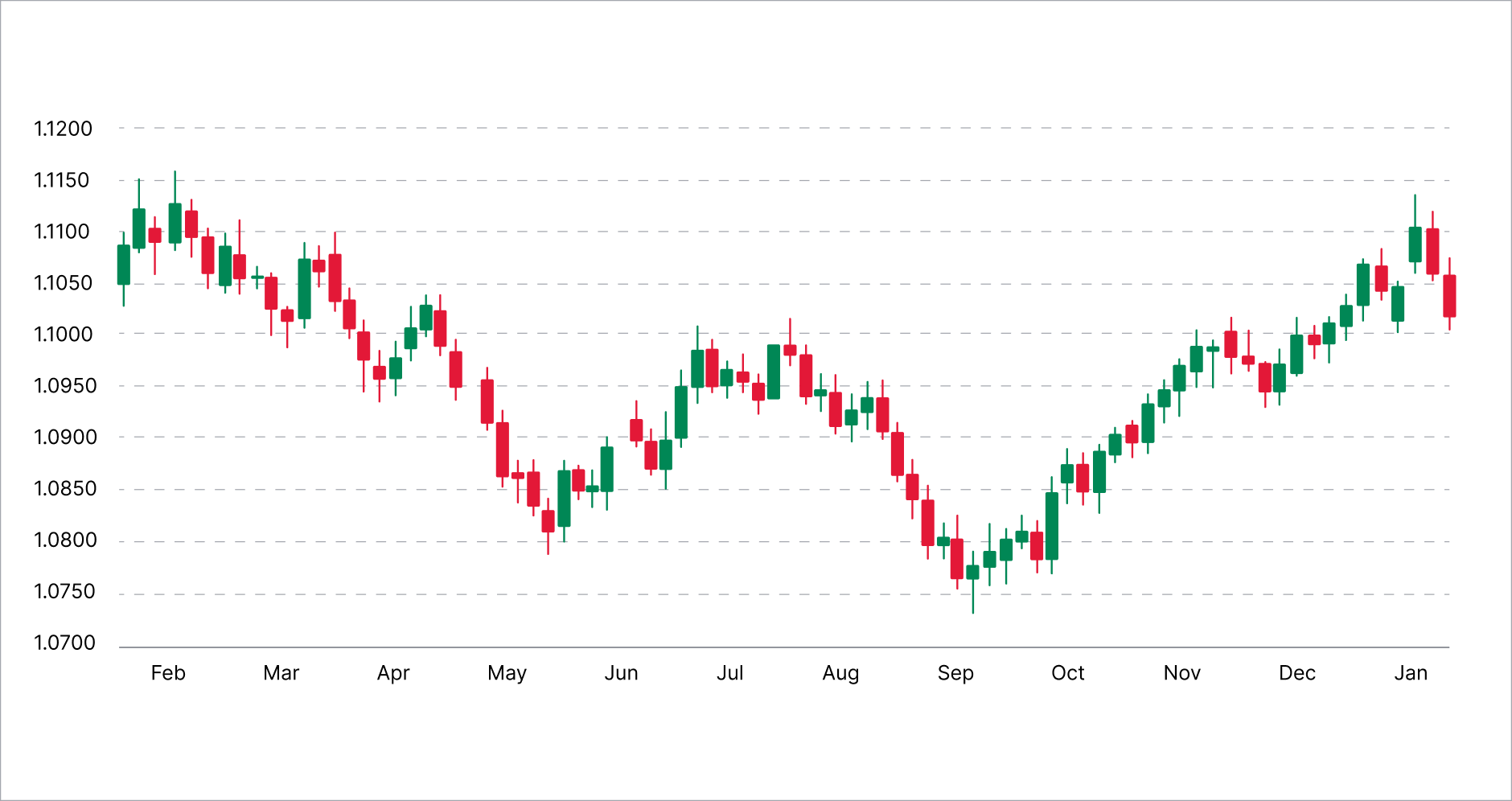
Like bar charts, each candlestick displays the opening, highest, lowest, and closing (OHLC) prices for a trading period. However, the information is presented using a rectangular body and upper and lower wicks, making price movements easier to interpret visually.
This allows traders to quickly identify whether buyers or sellers controlled the market during a particular period and assess the strength of recent price movements.
Since candlestick charts combine detailed information with a highly visual format, that other charts do not tend to include, they have become the preferred choice for many retail and professional traders.
Best suited for:
- Day-to-day market analysis
- Pattern analysis
- Traders relying on market sentiment
Comparing the main trading charts
|
Feature |
Line chart |
Bar chart |
Candlestick chart |
|---|---|---|---|
|
Displays closing prices only |
✓ |
✗ |
✗ |
|
Displays OHLC prices |
✗ |
✓ |
✓ |
|
Ease of interpretation |
High |
Moderate |
High |
|
Level of detail |
Low |
High |
High |
|
Beginner-friendly |
✓ |
✓ |
✓ |
No chart type is inherently better than another. Each presents the same market data in a different format, allowing traders to focus on different aspects of market behavior. The choice is essentially down to the traders’ goals and experience.
Which trading chart should beginners use?
The most suitable chart depends on what a trader wants to analyze.
For someone learning the basics of technical analysis, line charts provide a simple introduction to price movements and trends.
As trading knowledge develops, many traders transition to candlestick charts because they present more information while remaining easy to interpret. This combination of detail and clarity has made candlestick charts the industry standard across most trading platforms.
Bar charts remain a valuable alternative for traders who prefer a more traditional representation of price data or who are already familiar with reading OHLC charts.
Ultimately, the choice of chart is a matter of preference rather than accuracy. Since all chart types display the same underlying market data, selecting the right one is about choosing the presentation that best supports a trader's analysis.
Common mistakes
When learning technical analysis, traders sometimes assume that one chart type is more accurate than another. In reality, every chart is built using the same underlying price data.
Another common mistake is switching between different chart types too frequently. Constantly changing the way price information is displayed can make analysis less consistent and more difficult to interpret.
Finally, beginners sometimes choose highly detailed charts before understanding the fundamentals. Starting with simpler charts and gradually progressing to more detailed analysis often provides a stronger foundation for learning technical analysis.
Conclusion
Understanding the different types of trading charts is the first step toward reading and interpreting market behavior with confidence.
While line, bar, and candlestick charts all display the same price data, each presents that information in a different way. As traders gain experience, choosing the most appropriate chart becomes less about finding the "best" option and more about selecting the right tool for the type of analysis being performed.
In the next lesson, the focus shifts to the most widely used chart type in technical analysis - the candlestick chart and how traders interpret the information contained within a single candle.