
Introduction
Candlestick charts provide considerably more information than simple line charts while remaining easy to interpret. For this reason, they have become the preferred chart type for many traders analyzing the financial markets.
In the previous lesson, we covered the different types of trading charts and learned why candlestick charts are the most widely used in technical analysis.
Before learning how to identify trends, recognize chart patterns, or analyze support and resistance levels, it is important to understand what an individual candlestick represents.
In this lesson, you will learn how candlesticks are constructed, what information they contain, and how to interpret the price movements shown within a single trading period.
What is a candlestick chart?
A candlestick chart displays an asset's price movement over time using individual candlesticks.
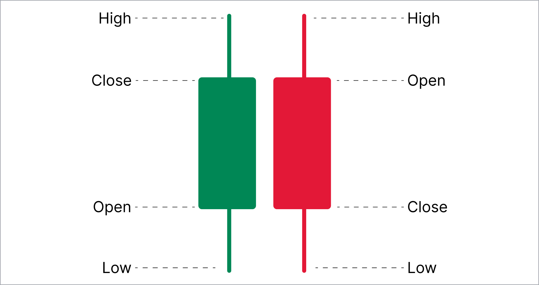
Each candlestick represents a timeframe which could be one minute, one hour, one day, or any other timeframe selected on the trading platform.
Unlike line charts, which display only closing prices, candlestick charts show four key prices for every trading timeframe, also known as OHLC:
- Open: The price at which the trading period begins
- High: The highest price reached during the trading period
- Low: The lowest price reached during the trading period
- Close: The final price reached during the trading period
This additional information allows traders to understand not only where the price finished but also how it moved during the trading session. This gives traders greater insight into market behavior than a line chart, making candlestick charts particularly valuable for technical analysis.
The anatomy of a candlestick
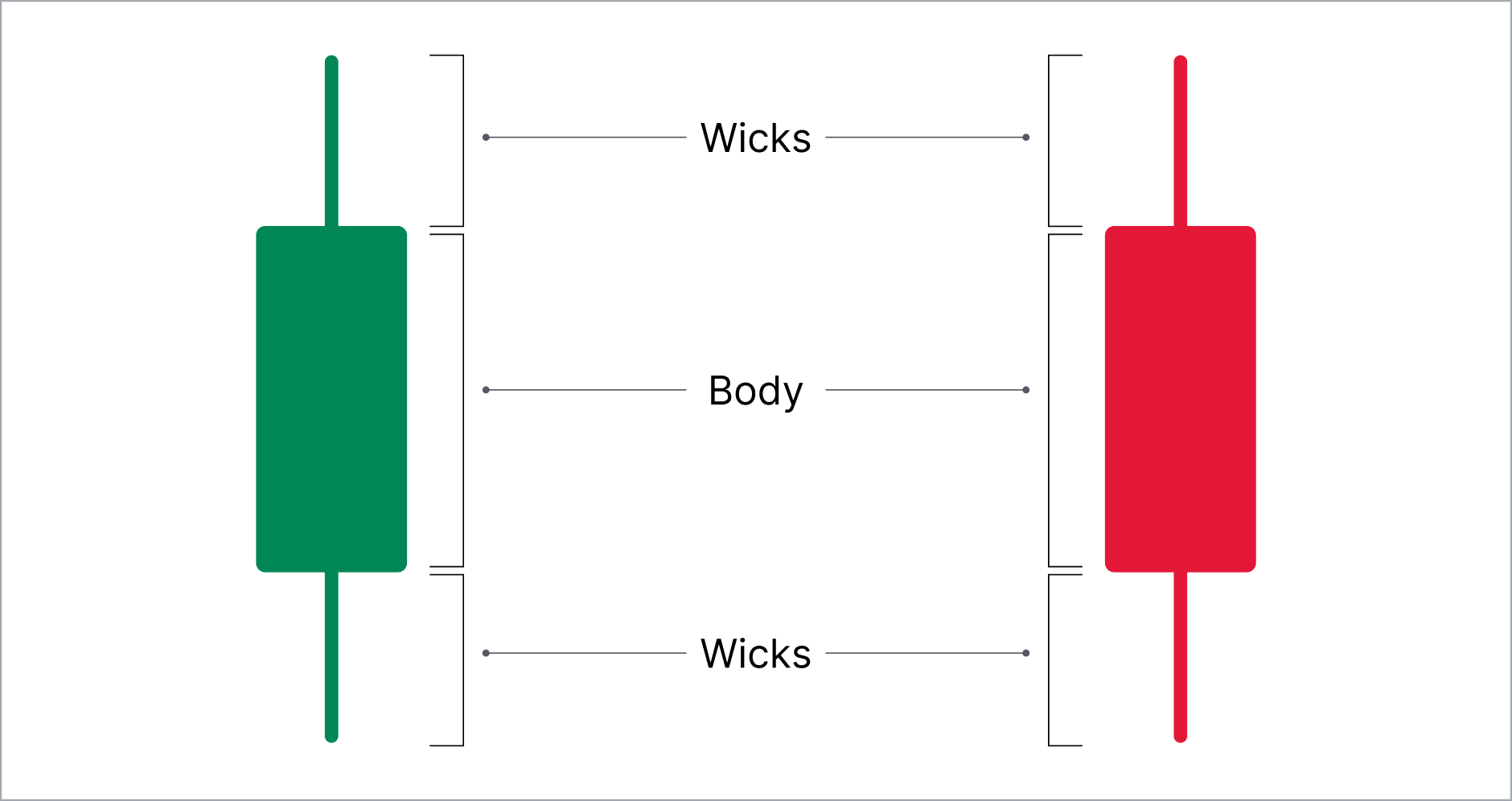
Candlesticks consist of two main components:
- The body
- The wicks
The body
The rectangular section of the candlestick is called the body. It represents the difference between the opening and closing prices.
A longer body generally indicates stronger buying or selling activity during that session, while a shorter body suggests relatively balanced market conditions.
The wicks
The thin lines extending above and below the body are known as wicks (sometimes referred to as shadows).
The upper wick shows the highest price reached during the trading period, while the lower wick shows the lowest price reached.
Together, the body and wicks show where the price opened, where it closed, and how far it moved in both directions before the candle completed.
Bullish and bearish candlesticks
One of the first steps in reading candlestick charts is learning to identify bullish and bearish candlesticks.
Bullish candlesticks
A bullish candlestick forms when the closing price is higher than the opening price. This suggests that buyers had greater control over price movement during that period.
Many trading platforms display bullish candles in green or white, although colors can usually be customized.
Bearish candlesticks
A bearish candlestick forms when the closing price is lower than the opening price.
This suggests that sellers were in control during that period, pushing prices lower before the candle closed.
Bearish candles are commonly displayed in red or black, depending on the platform settings. Regardless of the colors used, the relationship between the opening and closing prices remains the same.
What does the body reveal?
The size of a candlestick's body provides clues about the strength of price movement during that trading period.
A long body generally indicates that one side of the market maintained control for much of the trading period. A long bullish body suggests sustained buying pressure, while a long bearish body reflects sustained selling pressure.
A short body usually suggests that opening and closing prices were relatively close together. This in turn means that buying and selling pressure remained relatively balanced during that period. On its own, however, a short body should not be interpreted as a trading signal. It is simply one piece of information that contributes to the broader market picture.
What do wicks reveal?
While the body shows where price opened and closed, the wicks reveal how far the price travelled before the candle closed.
Long upper wicks: Buyers pushed prices higher before sellers regained control and drove prices back down before the candle closed.
Long lower wicks: Sellers pushed prices lower before buyers regained control and raised prices higher.
Short wicks: Prices remained relatively close to the opening and closing levels throughout the trading period. This may indicate more decisive price movement with relatively little rejection at higher or lower prices.
Reading market sentiment
Each candlestick reflects the ongoing interaction between buyers and sellers.
A single bullish candle does not necessarily mean prices will continue rising, just as a single bearish candle does not guarantee further declines. Instead, candlesticks provide insight into market sentiment during a specific timeframe.
By analyzing multiple candlesticks together, traders can begin identifying shifts in buying and selling pressure. Patterns such as the doji, hammer, and morning star may provide additional clues about market sentiment and potential reversals. These patterns should always be interpreted within the broader market context.
When combined with trend analysis, support and resistance levels, and other technical tools, candlesticks help traders build a broader understanding of market behavior rather than relying on individual candles alone.
Common mistakes when reading candlestick charts
Learning to read candlestick charts takes practice, and many traders encounter similar challenges.
Treating one candle as a trading signal
An individual candlestick provides useful information, but it should not be viewed in isolation. Experienced traders typically consider multiple candles alongside the broader market context before making trading decisions.
Ignoring the timeframe
A bullish candlestick on a five-minute chart may represent quite a different market picture than another one on a daily chart. Understanding how timeframes influence chart analysis is an important next step in learning technical analysis.
Focusing only on candle colors
Many beginners associate green candles with buying opportunities and red candles with selling opportunities. In reality, the color of a candle represents only one part of the information available. The size of the body, the length of the wicks, and the surrounding price action all contribute to a more complete understanding of market behavior.
Conclusion
Learning to read individual candlesticks lays the foundation for more advanced forms of technical analysis. Once traders understand what a single candle reveals about buying and selling activity, they are better prepared to interpret trends, chart patterns, and other market structures with greater confidence.
The next lesson explores how different chart timeframes influence analysis and why the same market can look different depending on the timeframe being viewed.